Sometimes, a job just kind of falls into place. I met Aram and Lauren of Renewal in the Wilderness while picking apples with some friends and family. After some quick correspondence, we decided that I was the person for the job and I got right to work.
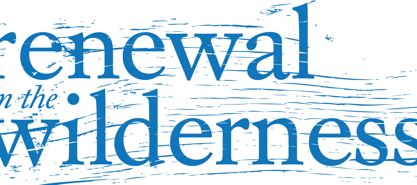
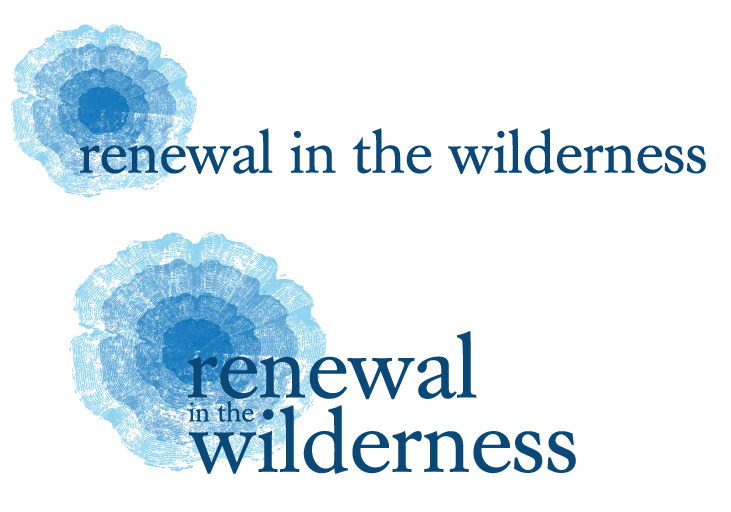
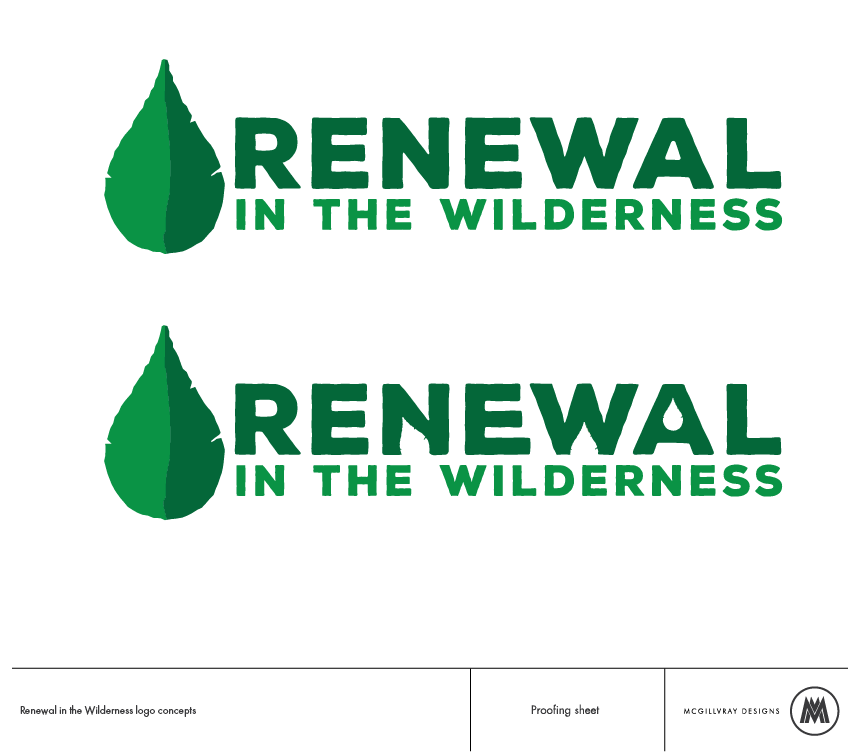
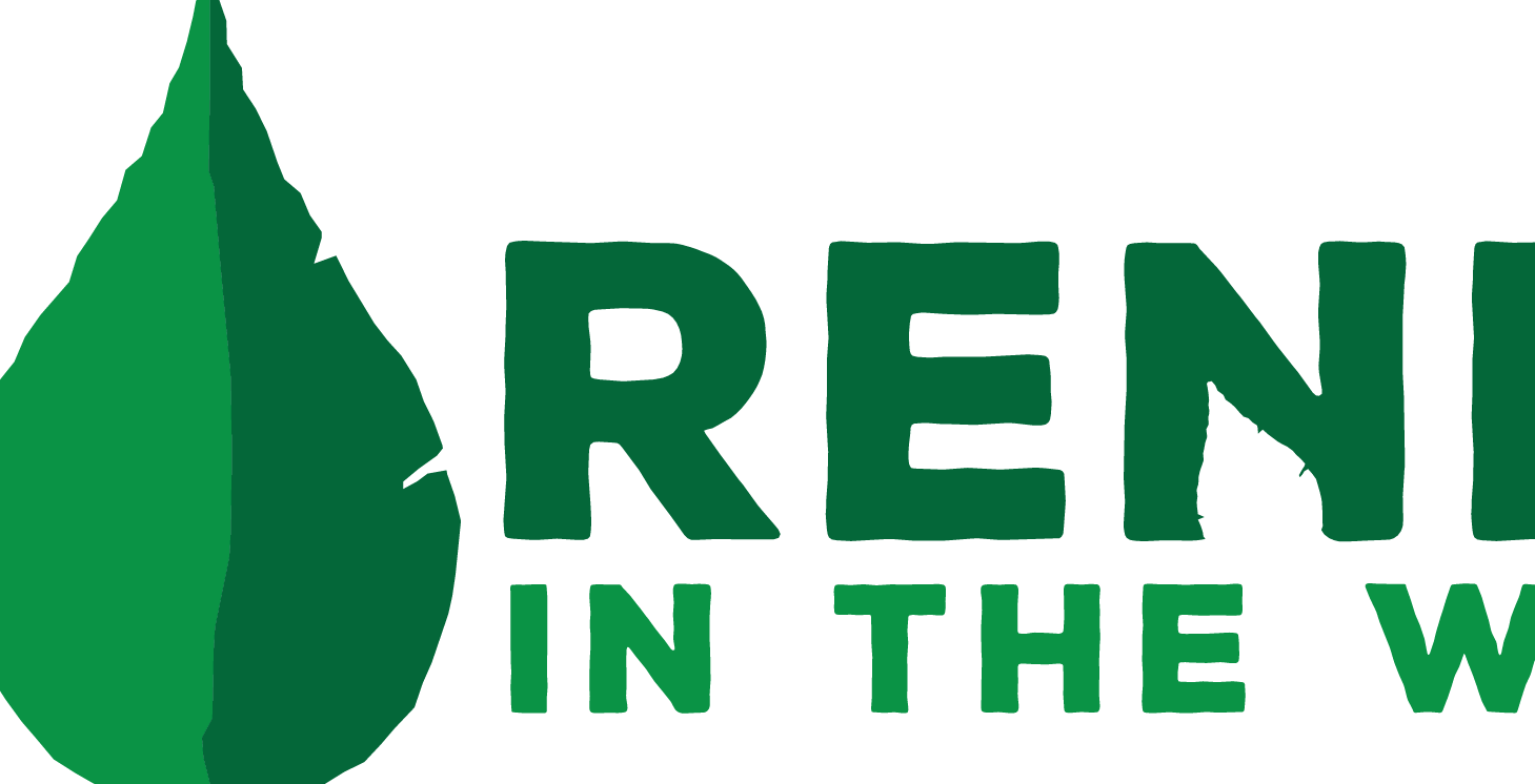
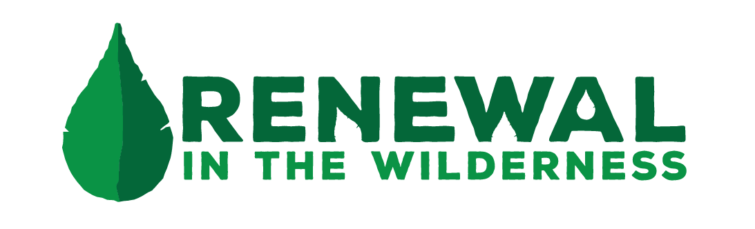
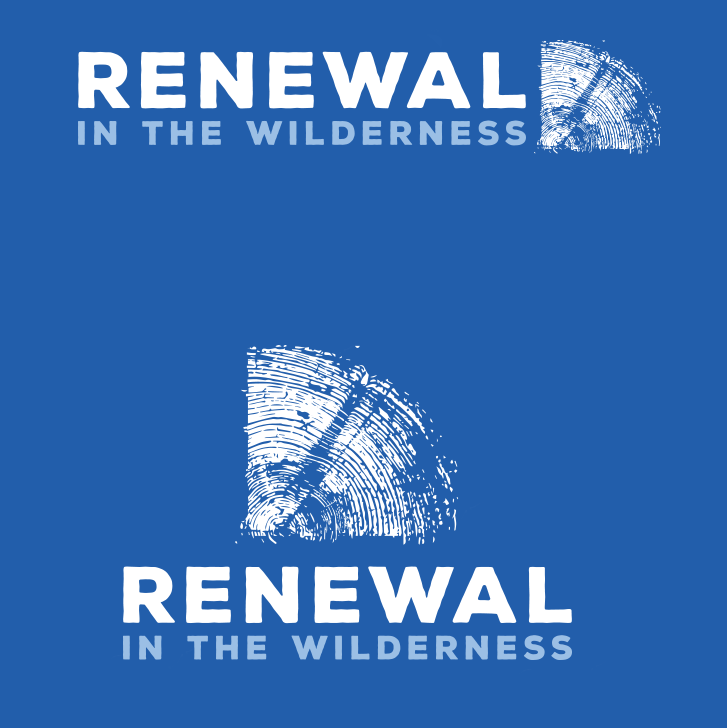
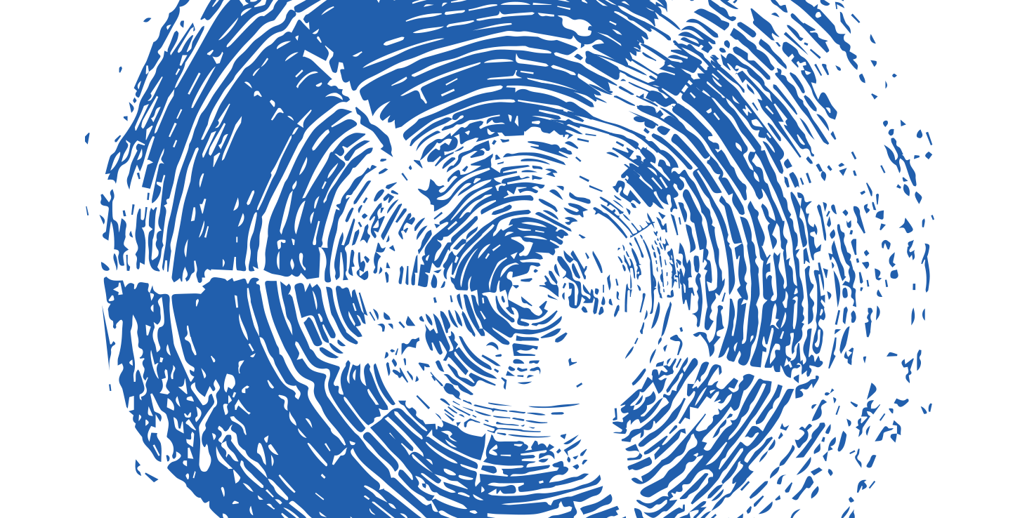
Renewal is a very loaded word and in order to try and encompass many meanings, we quickly decided on the imagery of a tree ring. A tree ring represents years of history and growth, but taken out of context can be ripples or waves; both water and land into one symbol. The typography is rustic enough to accompany the symbol and together they make a solid mark.
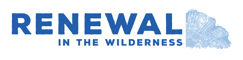
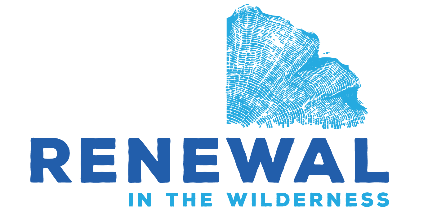
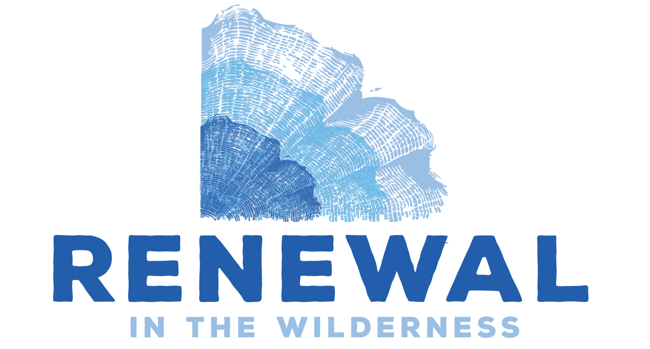
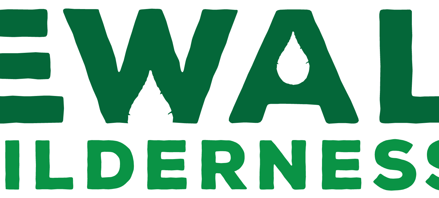
Additionally, the secondary/vertical logo uses the tree ring/ripples to emphasize the "NEW" in RENEWAL, so, bonus points?
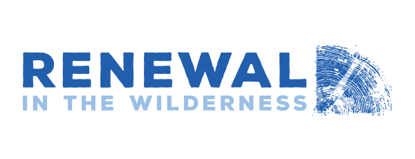
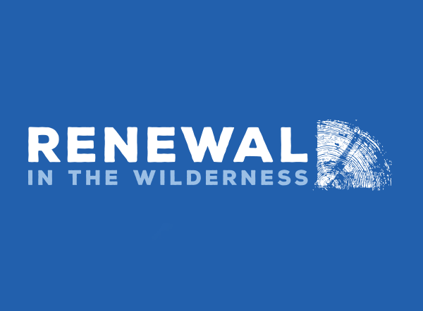
The primary logo.
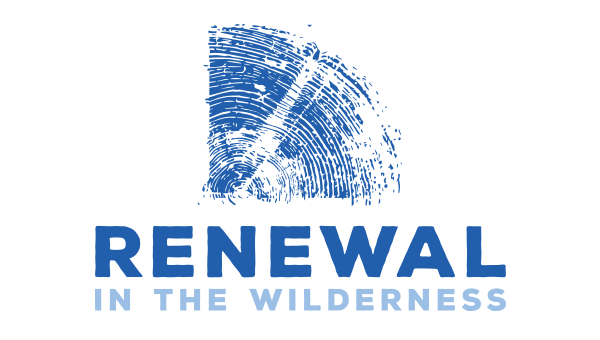
The secondary logo
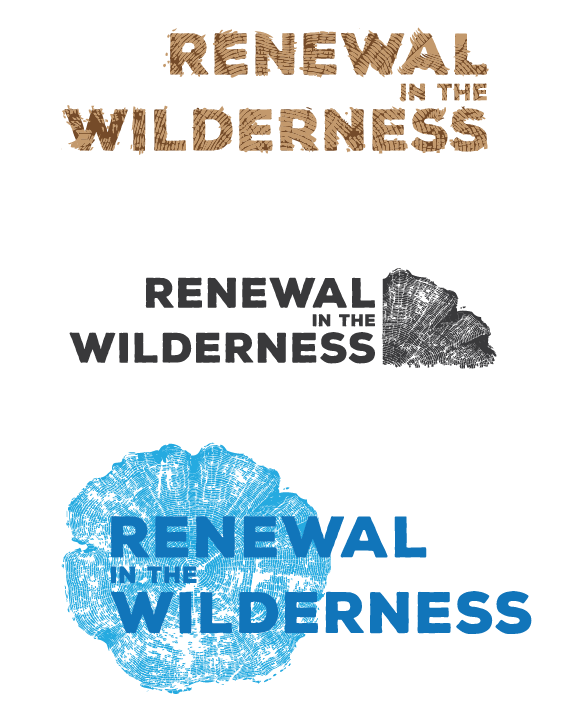
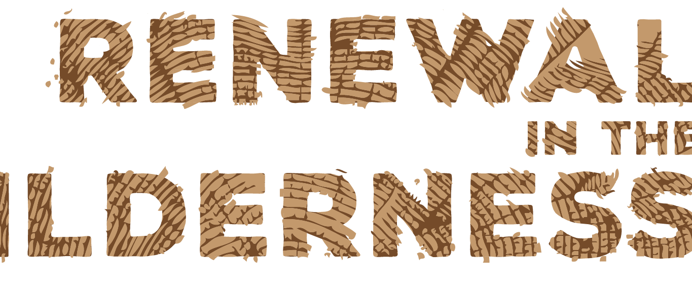
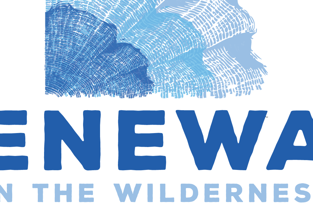
The pictures below are some process shots detailing the evolution of the logo.