As a graphic designer with ReVision Energy I was able to be involved in many different projects over my time there. Below is a sampling of work done while I was on the team.
Note: while I was there, ReVision underwent a rebranding (ReBranding?) that I was only partially involved in. The old logo is the yellow sun with the red arrows in it.
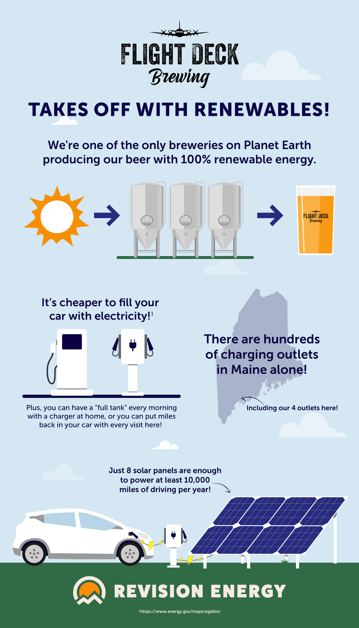
An infographic for Flight Deck Brewery giving their patrons facts about how much their solar array offsets.
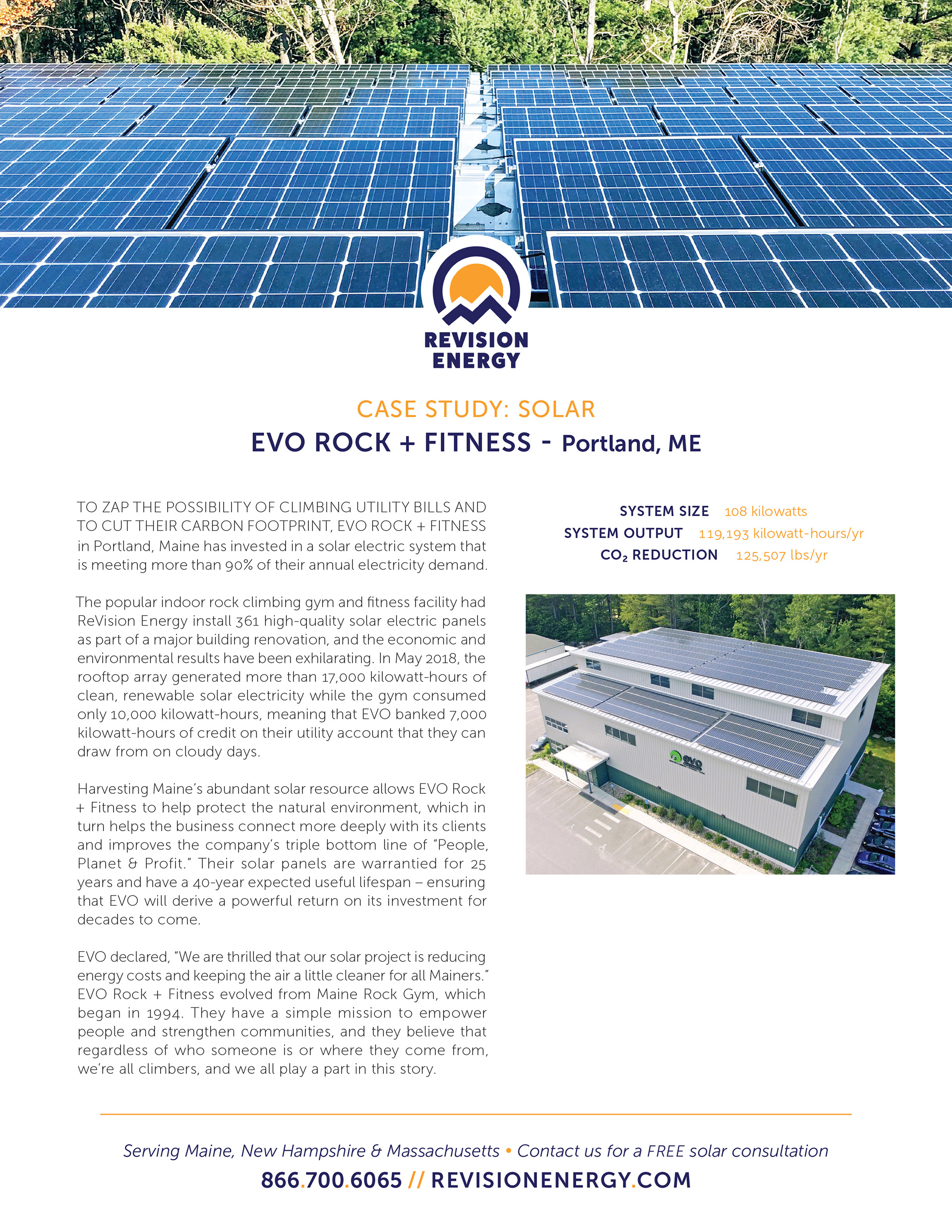
ReVision Energy case study design
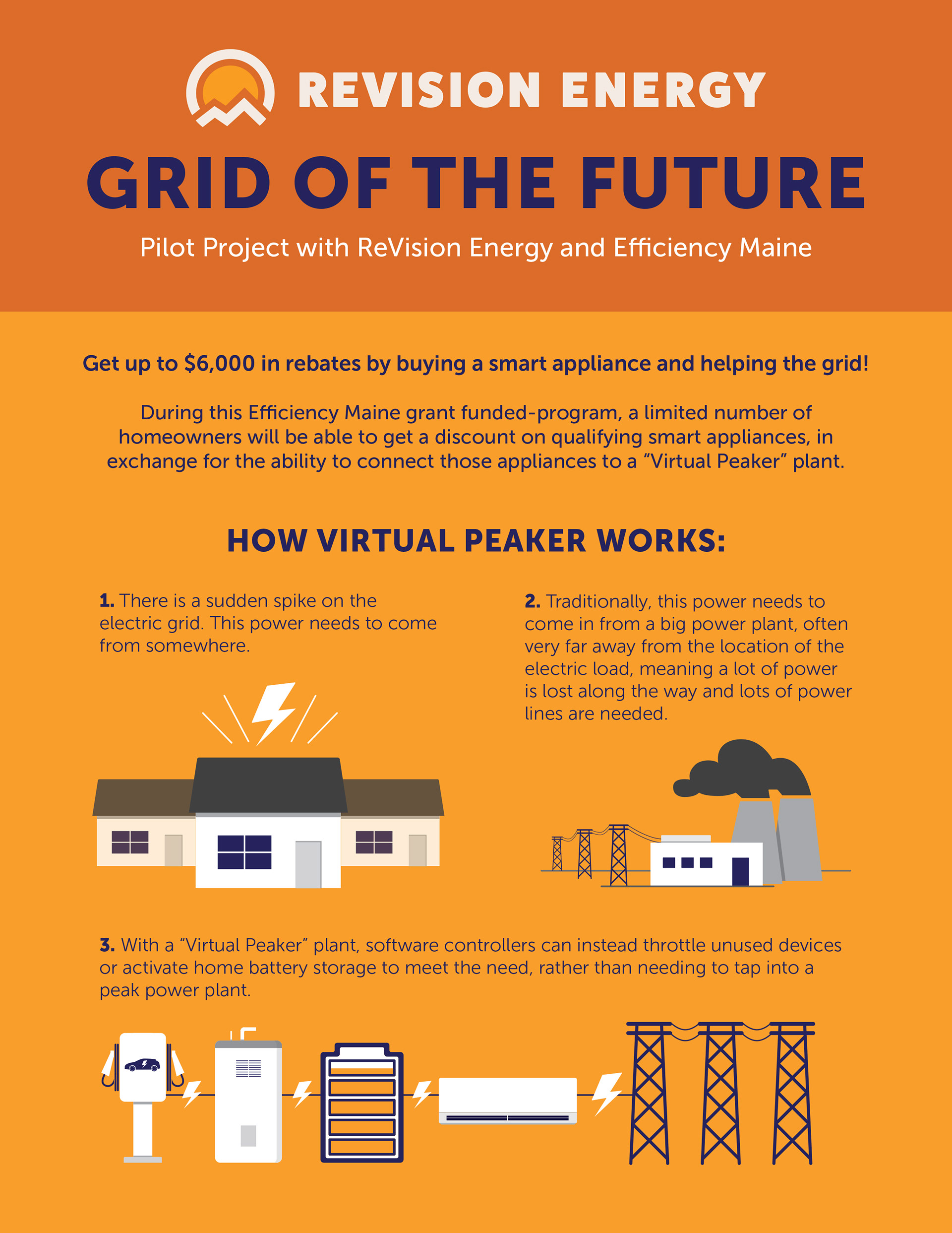
Page one of a flyer promoting a state-wide rebate program

Page two of a flyer promoting a state-wide rebate program

A poster made for the Grand Opening Party for a new Massachusetts branch of ReVision Energy

Cover for ReVision Energy's "Why Go Solar?" eBook. The eBook, which can be found here was also compiled and edited by me to be optimized for search engine discovery
Logo design for a wellness program within ReVision Energy. Elements of this logo are taken from the corporate logo, including the typeface (FatFrank) though in lower rather than uppercase, the blue color of the text and outside of the heart, and the two peaks of the heart, which were derived from the ReVision corporate icon