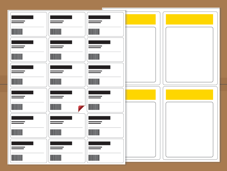
While working for advertising and branding company, Anania Bailey, I was tasked with creating a series of images for an email campaign for TrakTec, a local business based in Windham. My goal was to create something that expanded the branding and allowed for more creative expression. The brand was a little dry to start with, but I think that these images allow for a little more imagination than pages of specialty labels would normally have.

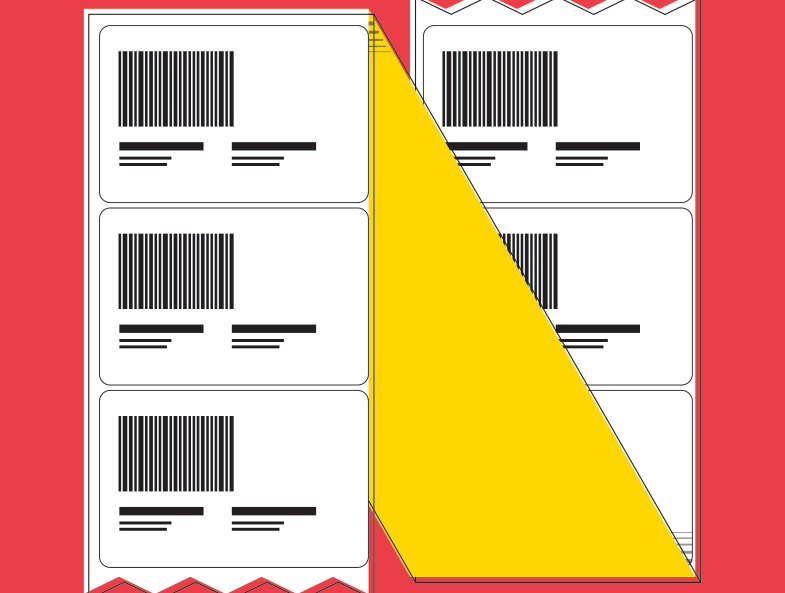

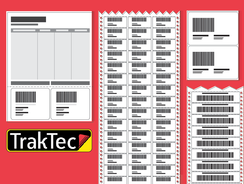
The TrakTec logo is included in the image above and you can see what I used to spin out the rest of the elements. I decided to stick to the color scheme as much as possible, I used the thin black outline, the rounded corners and the gradient lines from the upturned sticker to create illustrations that felt true to their design language. Otherwise, I wanted to abstract the product and use color and composition to engage viewers.